AppsFlyer Rebrand
I joined the AppsFlyer rebrand early in the process, brought on by Ruth Marom, who led the brand transformation. My role started with exploration and expanded into shaping how the brand moves across product, marketing, and video.AppsFlyer is a marketing measurement and analytics platform that helps teams understand where users come from, how customers move across channels, and what drives growth. The rebrand aimed to express that complexity in a way that feels clear, confident, and alive.At the heart of the new identity is the idea of an endless energy engine running under the surface. That inner energy is represented by fluid, expressive gradients, while the outer layer is built from sharp, structured elements like vector forms, boxes, typography, and UI-inspired components. Motion became the connective tissue between these two layers.
Gradient patterns
The work began with deep exploration of gradient behavior. Not just color, but movement: how gradients blend, flow, breathe, and sit within containers or alongside typography.
Many of the explorations leaned into an organic, almost edible quality, similar to melting ice cream. Soft and expressive, yet controlled. I explored variations in rhythm, density, and speed, building a flexible library of gradient behaviors that could shift between calm and energetic moments.
These studies helped define the color palette and emotional tone of the brand, and became a foundational ingredient of the identity.


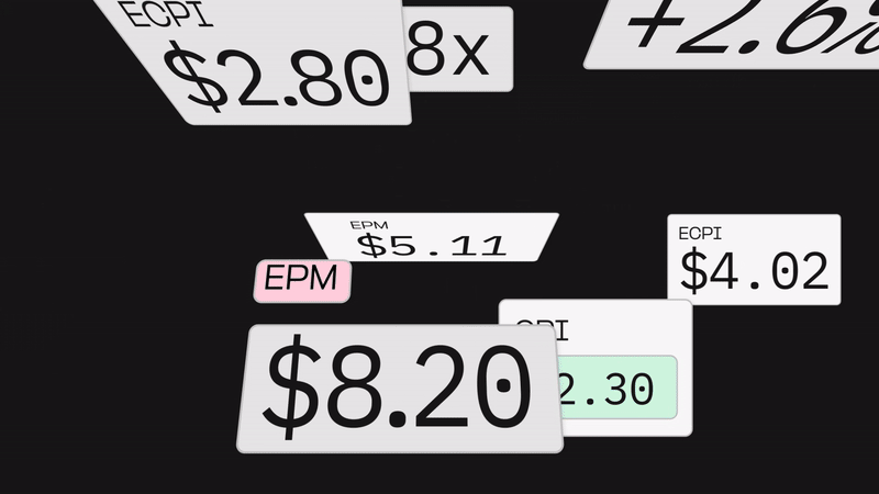
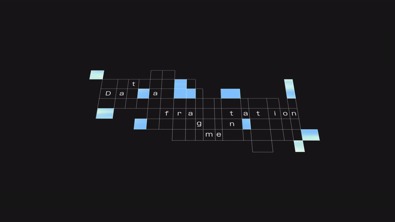
Motion system
With the energy core established, I expanded into building the full motion system. This is where the relationship between inner energy and outer structure took shape.The structured layer is made of sharp motion and clean components: vector boxes, typography, UI-like frames, and geometric transitions. These elements often open or shift to reveal the gradient layer beneath them, reinforcing the idea of a powerful mechanism running under the hood.I developed motion behaviors across key components, including headers, titles, supers, bullets, wipers, UI transitions, and timing rules, ensuring consistency across product and marketing touchpoints.


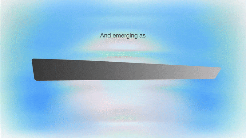
Logo animation
In parallel, I explored multiple logo animation directions, testing different reveal logics and rhythms. Through iteration, we landed on a final behavior that felt confident, modern, and system-driven, while still connected to the brand’s inner energy.

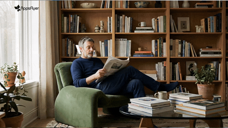
Product launch video
The main deliverable was a 45-second product launch video with narration. This piece brings the full system together: the gradient engine, structured motion language, typography, logo behavior, and product moments.
I designed and animated the film to feel cinematic and product-forward, while letting the underlying energy of the brand drive the emotional tone.


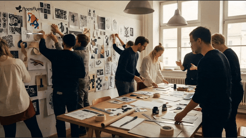
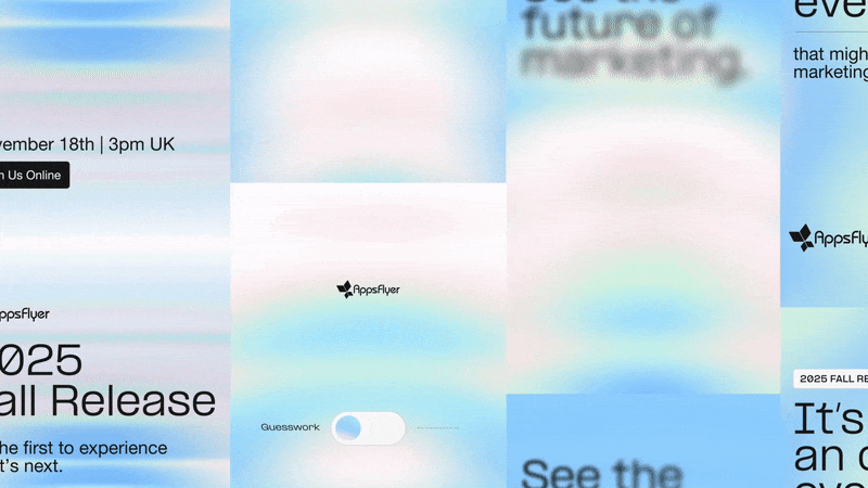
Social posts and supporting assets
Alongside the launch film, I animated supporting motion assets and social pieces, extending the system into modular formats and ensuring the rebrand lived across multiple touchpoints.
Credits