Everlaw – Discover the Difference
Over the past two years, we’ve been working closely with Everlaw on their ongoing brand campaign Discover the Difference. What began as a request to create a set of TV spots highlighting key platform features evolved into a long-term collaboration focused on defining how the Everlaw brand behaves in motion.Together with my creative partner Maayan Erlich, we developed a growing library of videos, modular assets, and motion systems that now shape how the brand communicates across platforms.
Everlaw is a cloud-based platform for litigation and investigations, built to help legal teams uncover insights quickly and collaborate more effectively. The Discover the Difference campaign was designed to highlight what sets Everlaw apart, while keeping the tone clear, calm, and human.

The Hero Video & the Hand
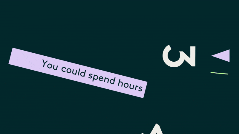
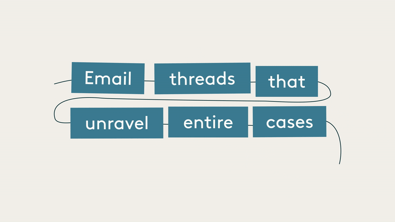
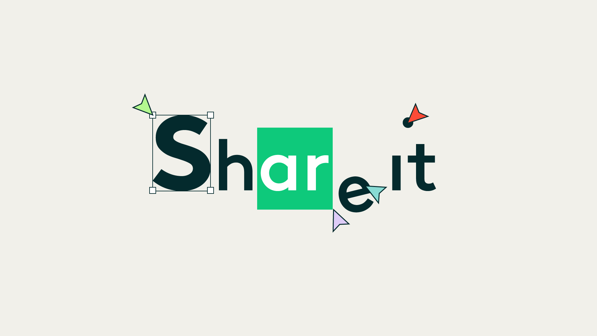
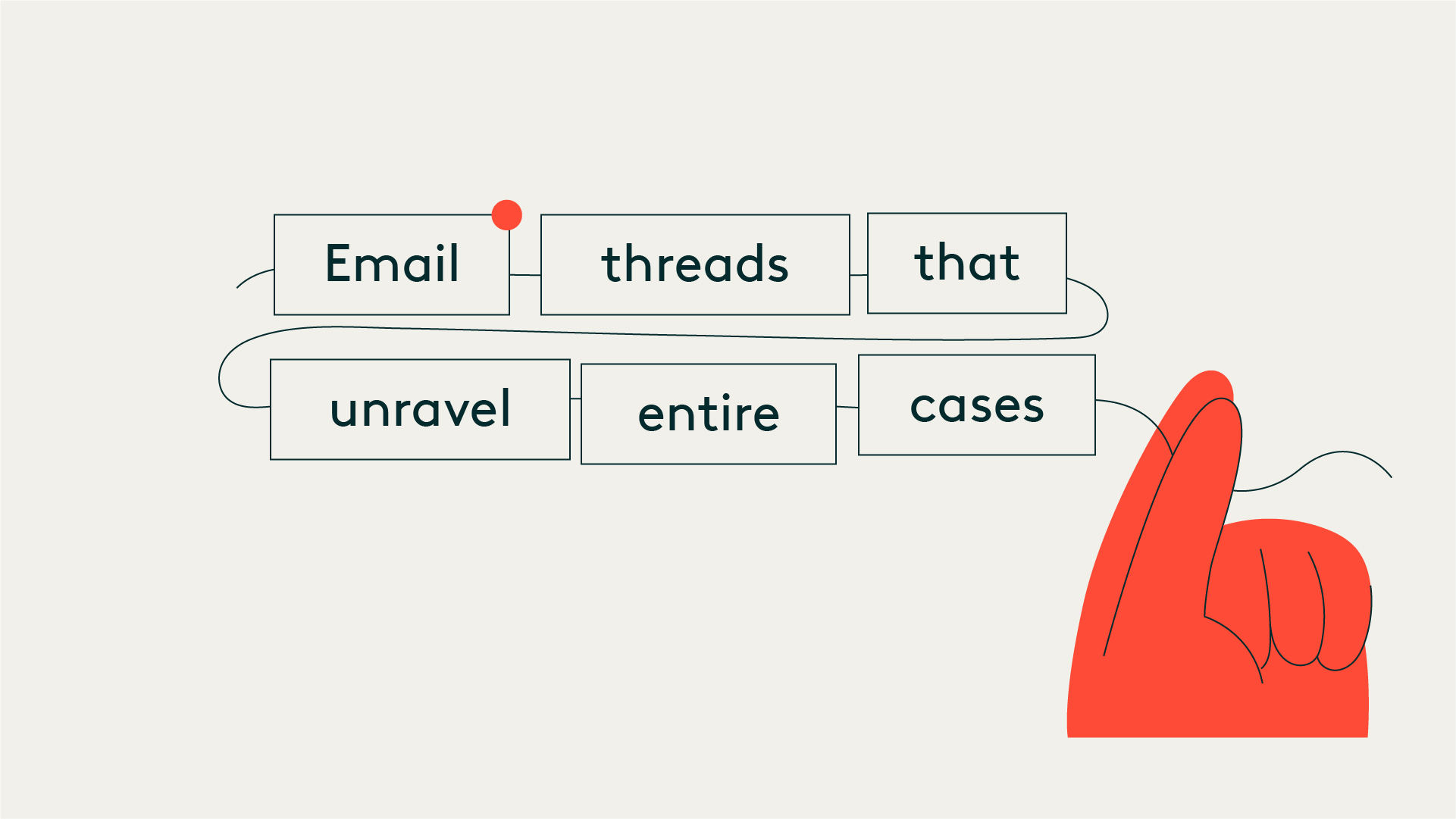
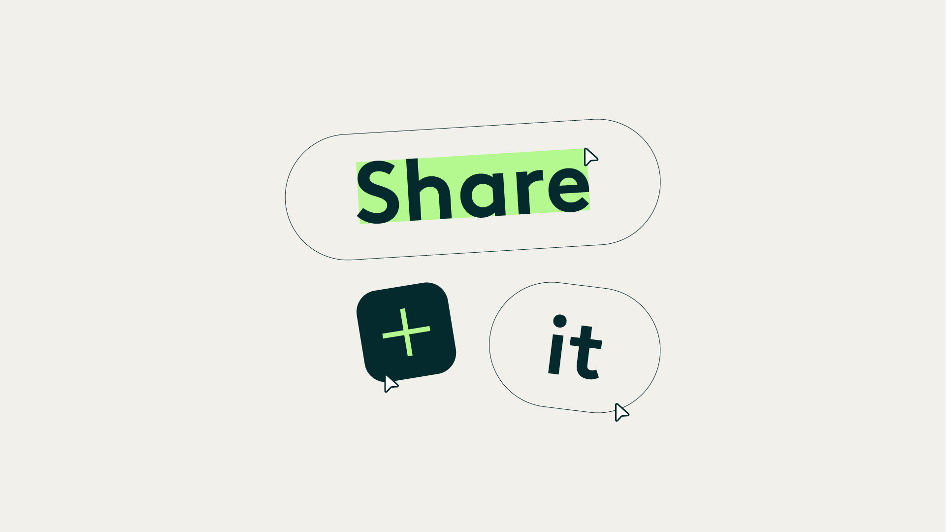
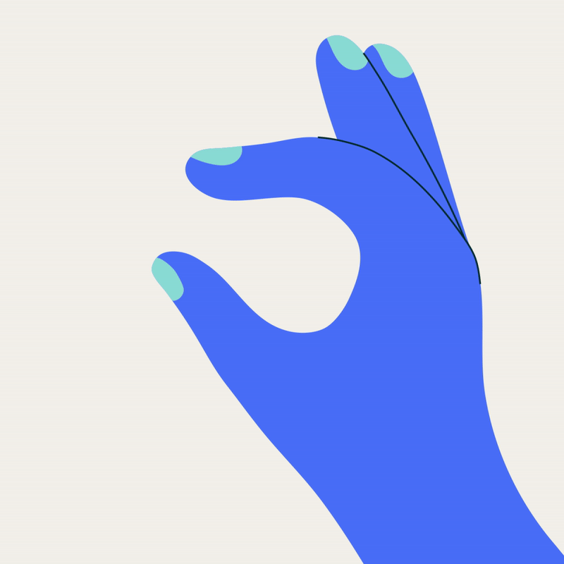
The first piece we created was the campaign’s hero video, which introduced a key element that carried through the entire project: the hand. Designed to add warmth and human presence, the hand interacted with typography and UI elements - holding words, pulling bars, triggering chain reactions, and guiding attention. This initial design became the foundation for all future variations. Across more than 12 videos, the hand evolved into a recognizable storytelling device, appearing in different forms and interactions while maintaining a consistent visual logic.


Brand → Motion
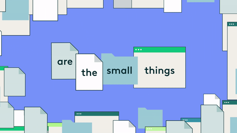
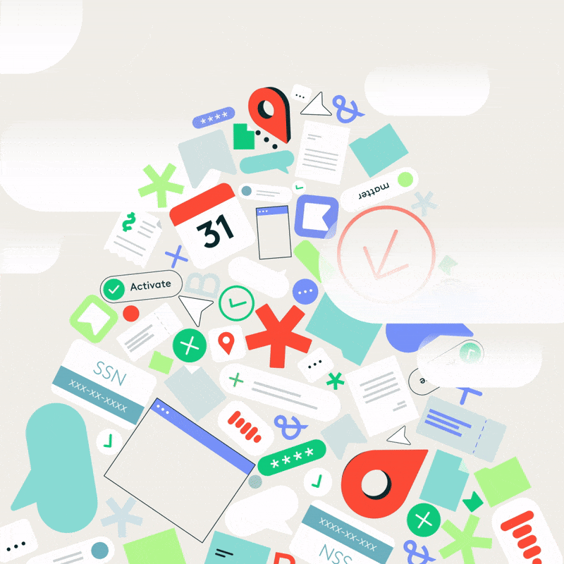
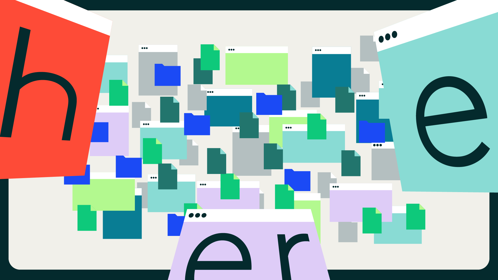
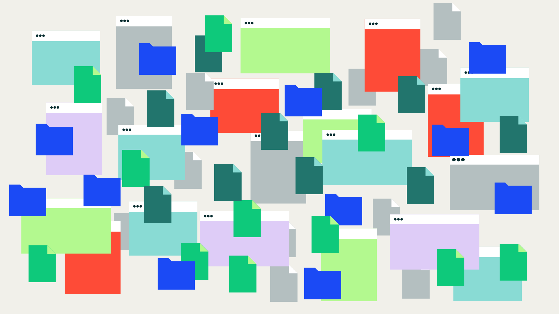
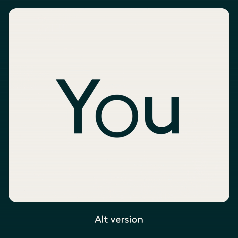
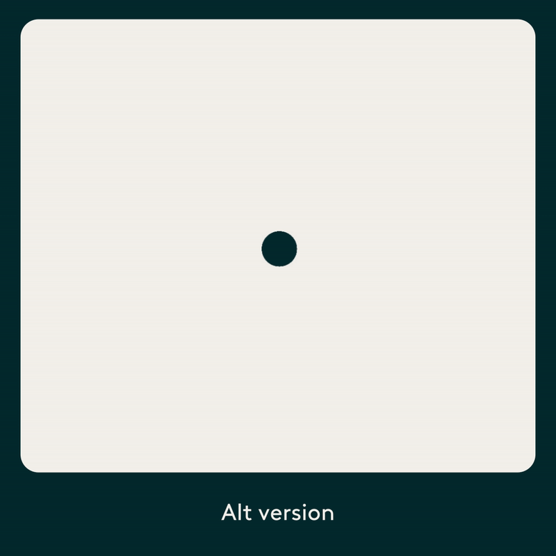
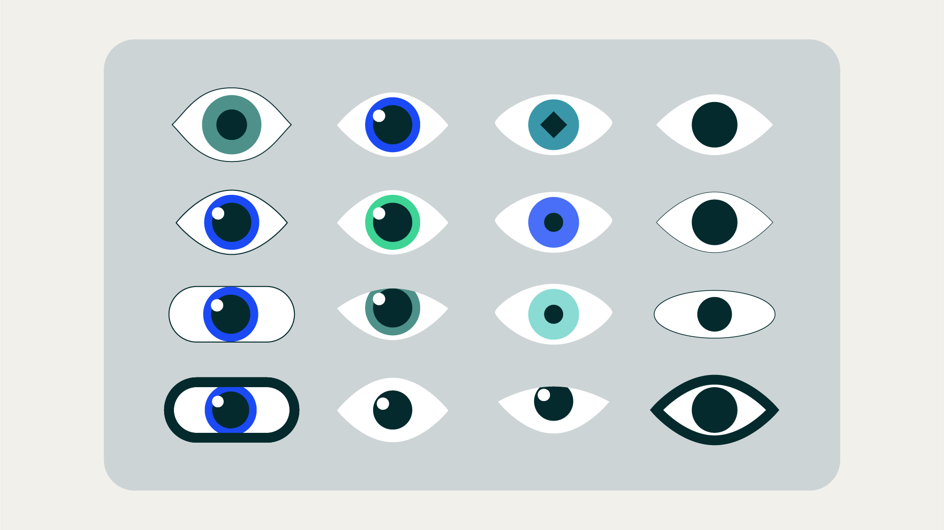
Everlaw’s visual identity gave us a strong foundation: a light parchment beige base, paired with vibrant accent colors and the Brown typeface. Our task was to translate this system into motion in a way that felt confident, approachable, and consistent.Since illustration wasn’t a core part of the brand, we created a new set of minimal, iconic visuals inspired by UI and everyday digital objects - search bars, keyboards, cursors, magnifying glasses, and interface elements. These simple shapes became the building blocks of the campaign’s motion language.
Brand → Motion
Everlaw’s visual identity gave us a strong foundation: a light parchment beige base, paired with vibrant accent colors and the Brown typeface. Our task was to translate this system into motion in a way that felt confident, approachable, and consistent.
Since illustration wasn’t a core part of the brand, we created a new set of minimal, iconic visuals inspired by UI and everyday digital objects - search bars, keyboards, cursors, magnifying glasses, and interface elements. These simple shapes became the building blocks of the campaign’s motion language.


Collaboration & Process
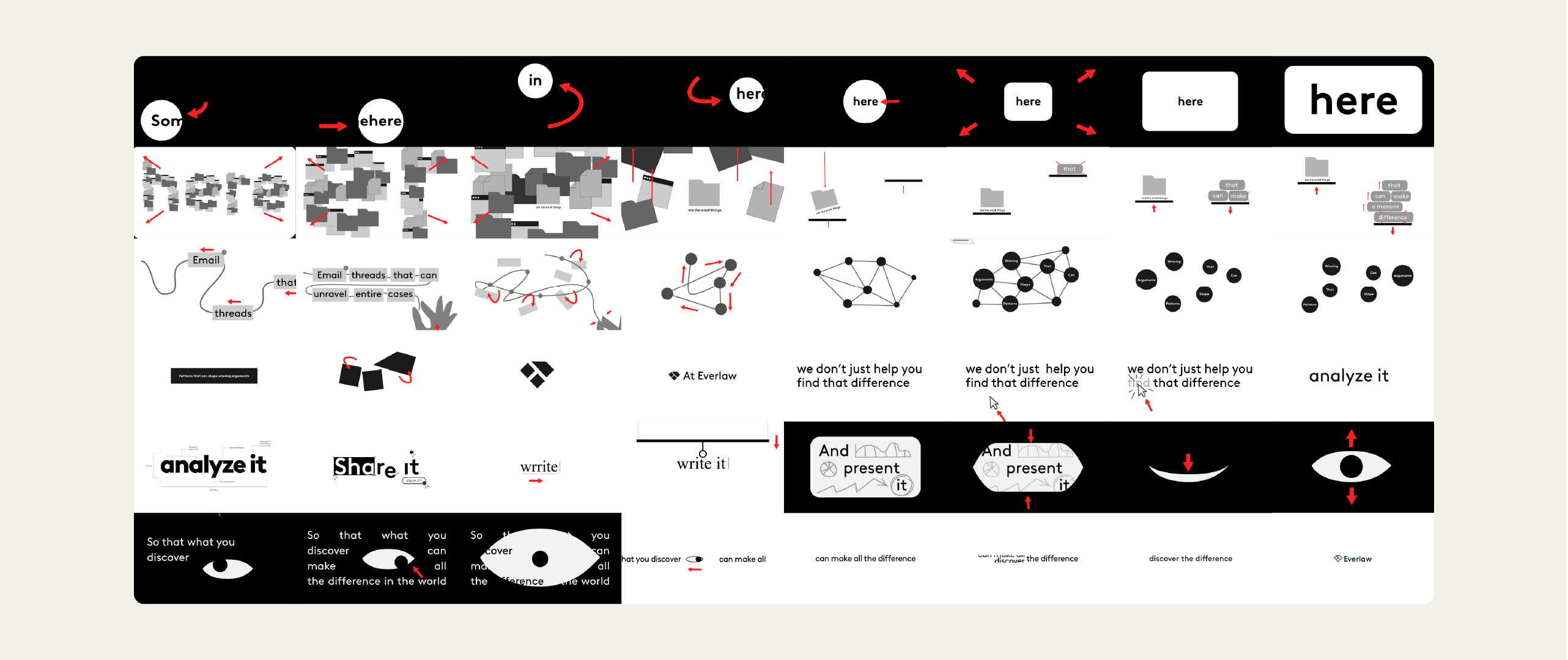
Each video began with copy and a clear feature focus. From there, we translated the ideas into storyboards, shaping the visual narrative and motion concepts. Those storyboards then guided the design and animation, allowing us to refine pacing, interaction, and clarity from concept to final delivery.
![]()
![]()
![]()
![]()
![]()
![]()
![]()
![]()
![]()
![]()
![]()
![]()
Collaboration & Process
Each video began with copy and a clear feature focus. From there, we translated the ideas into storyboards, shaping the visual narrative and motion concepts. Those storyboards then guided the design and animation, allowing us to refine pacing, interaction, and clarity from concept to final delivery.


TV Spots & QR End Cards
For the TV spots, we also designed a wide range of animated end cards featuring QR codes. These were tailored to each spot while staying fully aligned with the campaign’s visual system. Even within this constrained format, the end cards became an extension of the motion language rather than a purely functional element.
O

Outcome
What started as a single hero video grew into a cohesive campaign system spanning TV, social, and digital formats. The project is a strong example of how motion design can emerge through process - by deeply understanding a brand and gradually building a language that grows stronger with each iteration.